Trade Me
5 years of building the new look Trade Me alongside Tangram (Trade Me's Design System) has raised challenges for design, documentation, history management, and coordinating people. I've been solving these on the design system team, the application team, as an 'evangelist' coordinating and spreading the good word on building a modern, responsive application that's cohesive across our many sub-brands.
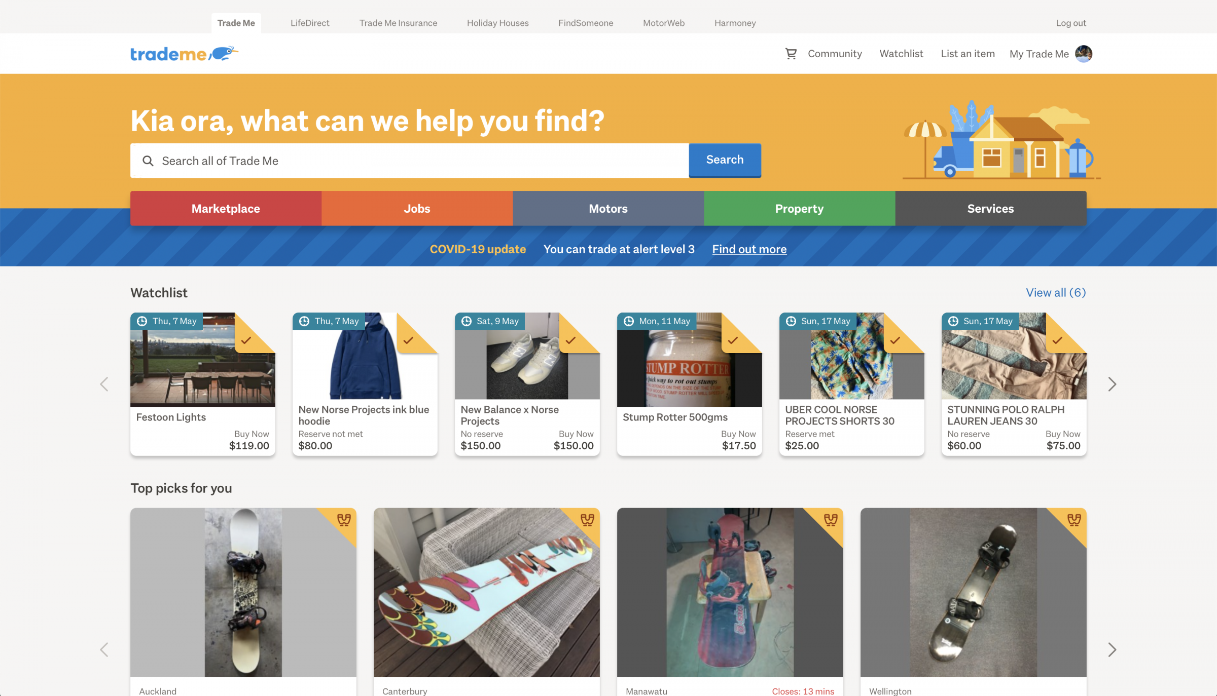
Trade Me Homepage during our interesting times
Tangram vision and work streams
Without a dedicated Design Systems team, I gathered a cross-disciplinary and cross-business to set out what Tangram looks like in the future, and how we can get there. With their expertise, and our customer mindset we took to the company that Tangram is 'where Trade Me looks first', a play on Trade Me's vision which is 'where Kiwis look first'.
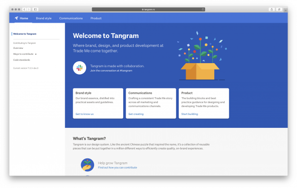
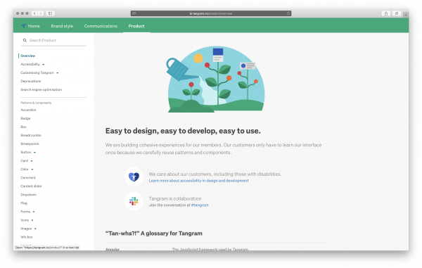
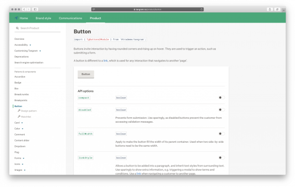
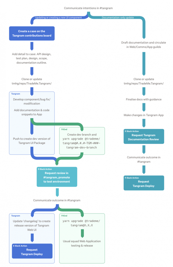
Clarification of the contribution process
In FY21 this translates to aligning our efforts to 4 core areas of improvement:
- Measure return on investment of Tangram usage and track over time
- Streamline the process of contributing documentation and updates
- Integrate Mobile DV / Native App Design System
- Maintain documentation, infrastructure & tooling
Training & Evangelism
Moving from a fixed width, bespoke-buttons-each-time method of building a website to a mobile-first, responsive, systems-led methodology was a massive shift in Trade Me's DNA.

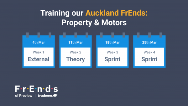
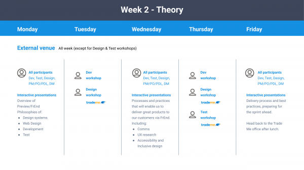
I led our design & product development teams through a series of 4 week training programmes, and ongoing support through evangelism of Tangram & our newly invigorated web design philosophies. This ran over the course of 18 months, across
- 3 office locations
- 4 business units serving their specific customer needs
- 22 product development teams
- 14 workshops
Trade Me now has all product development teams designing and building modern, delightful experiences in a cohesive way. As efficient in terms of throughput as creating the Classic Trade Me experience, but with the added benefits of maintainability, meeting or exceeding accessibility standards, responsively designed, and better set up for future developments.
Trade Me Design Vision
In 2017 Trade Me has a vanilla design system, and the beginnings of the next gen replatforming of the website. Alongside this, we had a major rebrand with new Typography, logo and personality.
So we brought this new brand to the UI: Trade Me Design Vision (TMDV) was born.
Design Vision Road Test Sprints
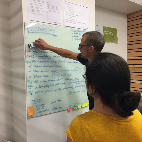
A series of design sprints to bring our brand to life in our web experiences – I fronted the Navigation & core search as well as Sell/List an item process.
Global Navigation
Four main goals encompasses the site-wide navigation of Trade Me:
- a 'safe harbour' for our members to reset or start a new search,
- clearly communicate way finding and the IA,
- personify our brand, and
- provide an extensible framework for the distinct business units (Jobs, Property, etc.) to best serve their specific customers.

Global Navigation - Property

Global Navigation - Jobs


Initial IA explorations through card sorting coupled with regular usability testing sessions in house as well as on street formulated the solution used on Trade Me's new-look site.
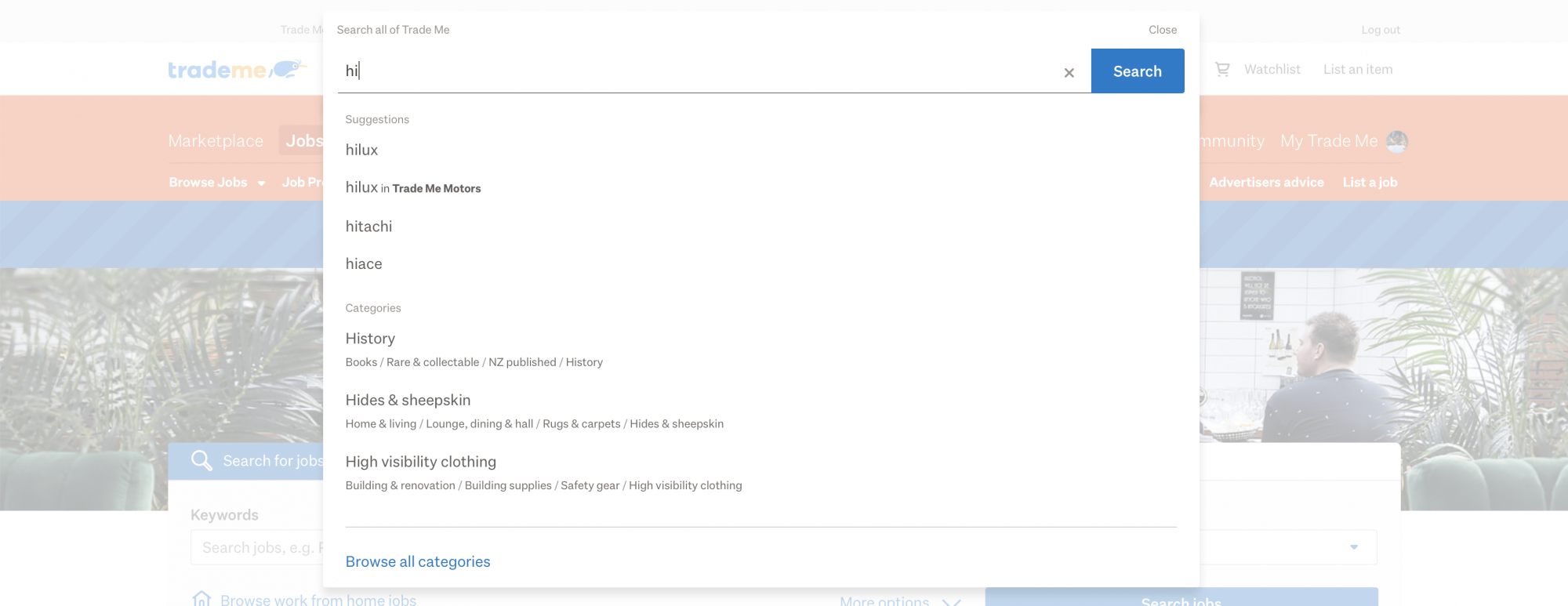
Navigation - Global Search
Sell Process
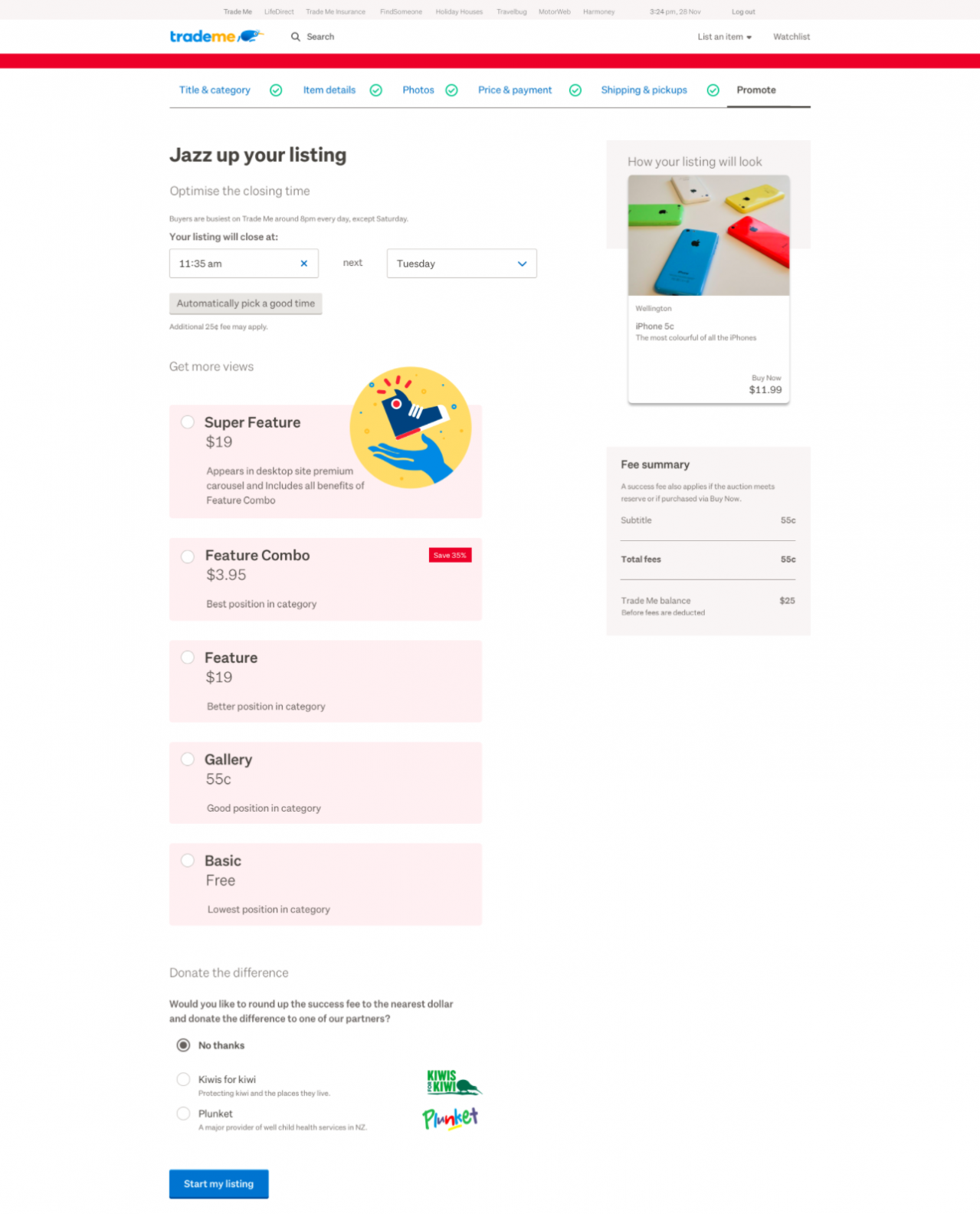
"Jazz up your listing" – bringing some fun to promoting your new listing on Trade Me
Considering Trade Me's users may sell dozens if not hundreds of items per year, Job, Car and Property listings are far less common.
The goal of cohesion across our Sell Processes was to allow learnings of common flows in Marketplace to transfer in a comforting way to the higher stakes flows in high value items.
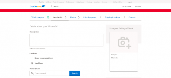
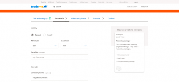
Among the new additions is a real time update of how your listing will appear in search results as the customer adds further details, photos, and promotional extras.
Design Vision Team
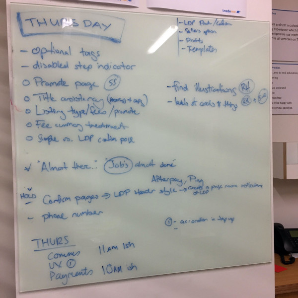
The amalgamation of front end experts and designers were assembled to implement the vision in Trade Me's new experience. I led the team together with our Head of Design, bringing detail and finesse to the Design Sprint concepts for each and every core Trade Me experience.
Secondments from around the business joined us for periods of two weeks so that the knowledge and vision could effectively be spread throughout the business via those champions of DV.
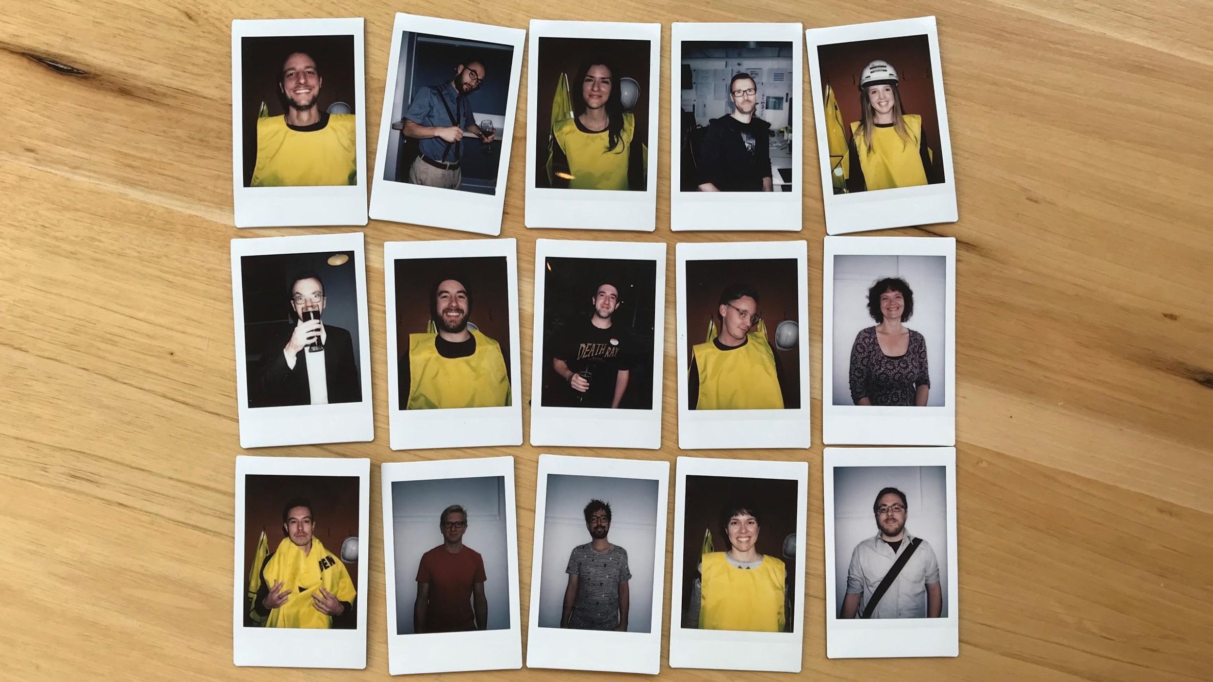
The Design Vision Team, December 2017